How to Layer Printed Shirts Without Losing Impact
A great printed shirt should never disappear under the rest of your outfit. The point of learning how to layer printed shirts is not to tone down the design. It is to frame it, give it depth and make it work beyond the two-week window when a shirt-and-trousers look feels enough.
British weather makes layering practical. Personal style makes it worth doing. A bold shirt can carry an overshirt in early autumn, sharpen knitwear in winter or bring a tailored jacket to life on an evening out. The trick is knowing which layer gets attention, which layer adds texture and when to stop.
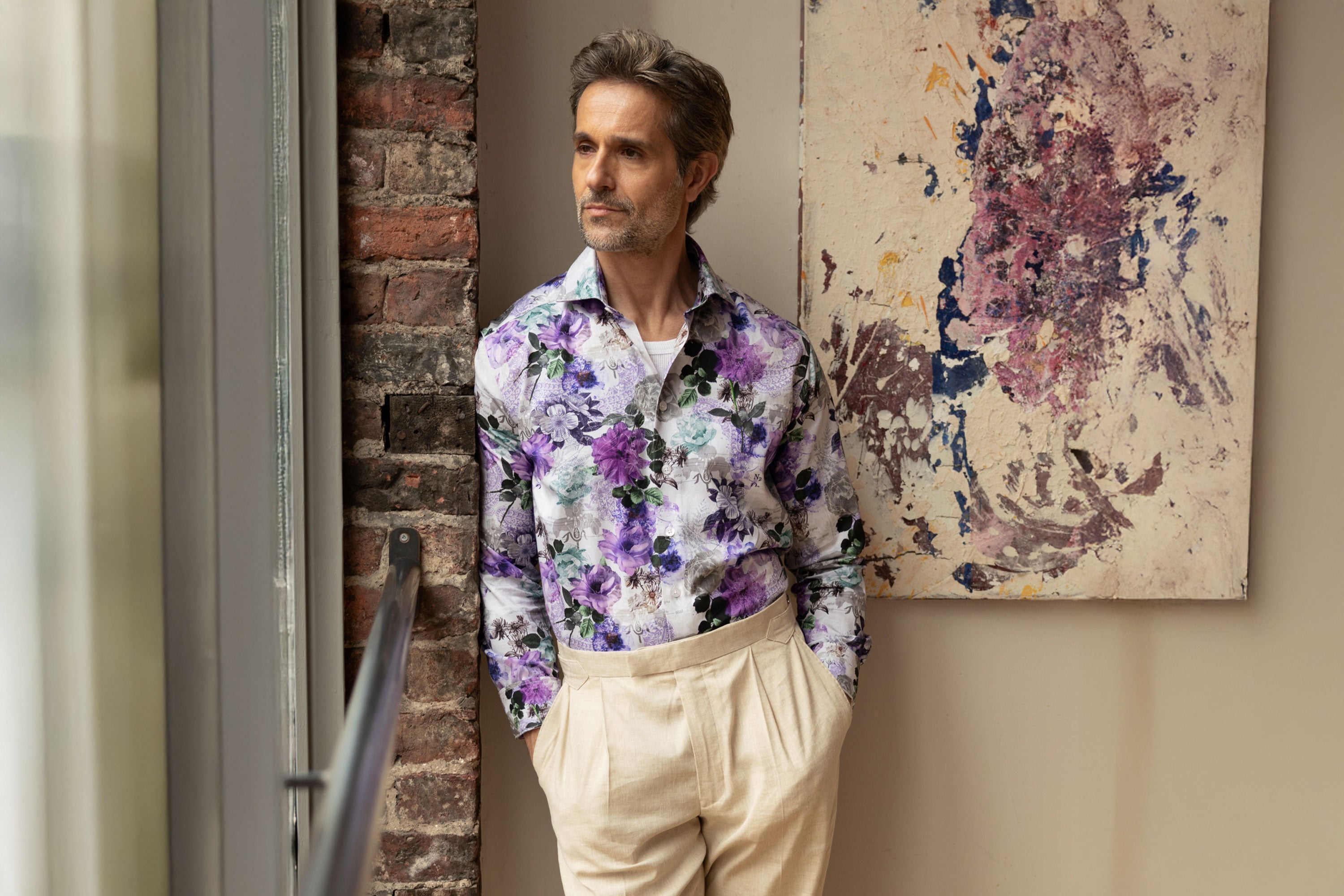
Start with the shirt as the focal point
A printed shirt is already doing more visual work than a plain white Oxford. Treat it as the centre of the outfit and let everything around it support the print rather than compete for space.
That does not mean every other piece must be bland. It means the layers need a clear role. A navy merino crew neck adds warmth and a clean frame. An olive overshirt brings utility and contrast. A charcoal blazer creates structure. Each gives the shirt somewhere to stand out without asking it to fight against another loud pattern.
Look at the colours already present in the print before choosing your outer layer. Pick out one quieter shade rather than automatically matching the boldest one. If the shirt features electric blue, rust and cream, a deep navy jacket or ecru knit usually feels more considered than adding more bright blue. You are creating a connection, not a uniform.
Choose a base that keeps the look clean
Layering begins underneath the shirt as much as above it. For most long-sleeve printed shirts, a plain white, black, navy or grey T-shirt works well when the shirt is worn open. The best choice depends on the print and the mood you want.
White makes colour feel fresh and relaxed, particularly with lighter prints and summer-weight fabrics. Black gives graphic designs more edge and suits evening plans. Navy and grey are useful middle ground, offering contrast without the hard line that black can create.
Keep the T-shirt fitted but not tight. If it is too loose, the shirt will sit awkwardly and the collar can lose shape. If it is overly slim, the layers can look forced. A simple crew neck is usually the strongest choice because it leaves the print visible while keeping the outfit tidy.
For a smarter direction, skip the T-shirt and button the shirt properly. A printed shirt under knitwear or tailoring looks more polished when the collar sits cleanly and the front is not bunching. This is where fit matters most: enough room through the chest and shoulders for movement, but no excess fabric spilling out beneath the next layer.
How to layer printed shirts with knitwear
Knitwear is one of the easiest ways to extend the life of a statement shirt. The collar and a small flash of print at the cuffs are often all you need. It is a restrained approach, but it does not feel safe or forgettable.
A fine-gauge crew neck is the most versatile option. Choose a solid, darker tone for a sharp contrast or a soft neutral such as stone, oatmeal or tobacco if the shirt carries warmer shades. Let the collar sit naturally over the neckline rather than flattening it into place. A little ease makes the outfit feel lived-in rather than overly arranged.
V-necks reveal more of the shirt, which makes them ideal when the pattern deserves a bigger role. Go for a clean, fairly shallow V-neck. A very deep cut can shift the look towards officewear from another era, while a neat V gives the print a clear central panel.
Cardigans offer a more relaxed version of the same idea. A plain button-through cardigan, worn open or with only the middle buttons fastened, breaks up the shirt without hiding it. This works particularly well with geometric prints, where the straight lines of the cardigan create a calm structure around the design.
Texture is useful here. Lambswool, merino and cotton knitwear all bring something different, but avoid heavily patterned Fair Isle knits or loud stripes over an equally expressive shirt. Two competing patterns can work, but only when scale, colour and confidence are all exactly right. Most of the time, one print is the better decision.
Use overshirts and jackets to add shape
An overshirt is made for the in-between months. Worn open over a printed shirt and plain tee, it adds a casual third layer without making the outfit feel bulky. Keep the overshirt plain and choose fabrics with presence: brushed cotton, twill, suede or lightweight wool all give the look dimension.
Colour is where personality can come through. Navy, olive, chocolate and sand are dependable choices because they work with a wide range of prints. A washed black overshirt adds a sharper, city-ready finish. If the shirt has a dark base, a lighter outer layer can stop the outfit becoming too heavy. If the print is bright or pale, a darker layer gives it definition.
For evenings or smarter occasions, reach for an unstructured blazer. A printed shirt beneath navy or charcoal tailoring is a confident alternative to the predictable plain-shirt formula. Keep the blazer simple, with minimal texture and no obvious checks. The shirt should feel intentional, not like an afterthought added to a formal look.
A leather jacket can work too, especially with graphic or darker prints. The contrast between a refined shirt and a tougher outer layer is the appeal. Keep the trousers straightforward - black denim, dark indigo jeans or tailored black trousers - so the jacket and shirt remain the story.
Get proportion right before adding more
The quickest way to lose a strong look is to add layers with no attention to length or weight. If every piece is long, loose and heavy, the outfit can feel shapeless. If every layer is cropped and fitted, it can feel restrictive.
A useful rule is to vary the weight, not necessarily the length. A lightweight printed shirt under a substantial overshirt creates contrast. A crisp cotton shirt beneath fine knitwear keeps the silhouette neat. If you are wearing a longer coat, make sure the layers below do not bunch around the hips.
Your trousers matter too. Straight-leg chinos, dark denim and relaxed tailored trousers are reliable foundations. Very distressed jeans can pull attention away from the shirt, while extremely skinny trousers can make layered upper halves look top-heavy. A cleaner, balanced leg gives bolder shirting room to do its job.
Build colour confidence without matching everything
Matching every colour in a print can make an outfit look overly planned. Instead, repeat one shade once, then let the rest breathe. A patterned shirt with burgundy detail might sit under a navy jumper with dark brown boots. The burgundy does not need to appear again for the outfit to feel coherent.
Neutrals are not a retreat from colour. They are what make colour look deliberate. Ecru denim can lift a rich blue or green print. Charcoal flannel trousers bring sophistication to brighter designs. Navy is particularly useful because it offers depth without swallowing the character of the shirt.
If you want to introduce a second colour, do it through one small element: a pair of socks, a cap, knitwear or an outer layer. Keep it in the same family as the shirt rather than reaching for a completely unrelated statement. The goal is expressive, not noisy.
Make the look suit the setting
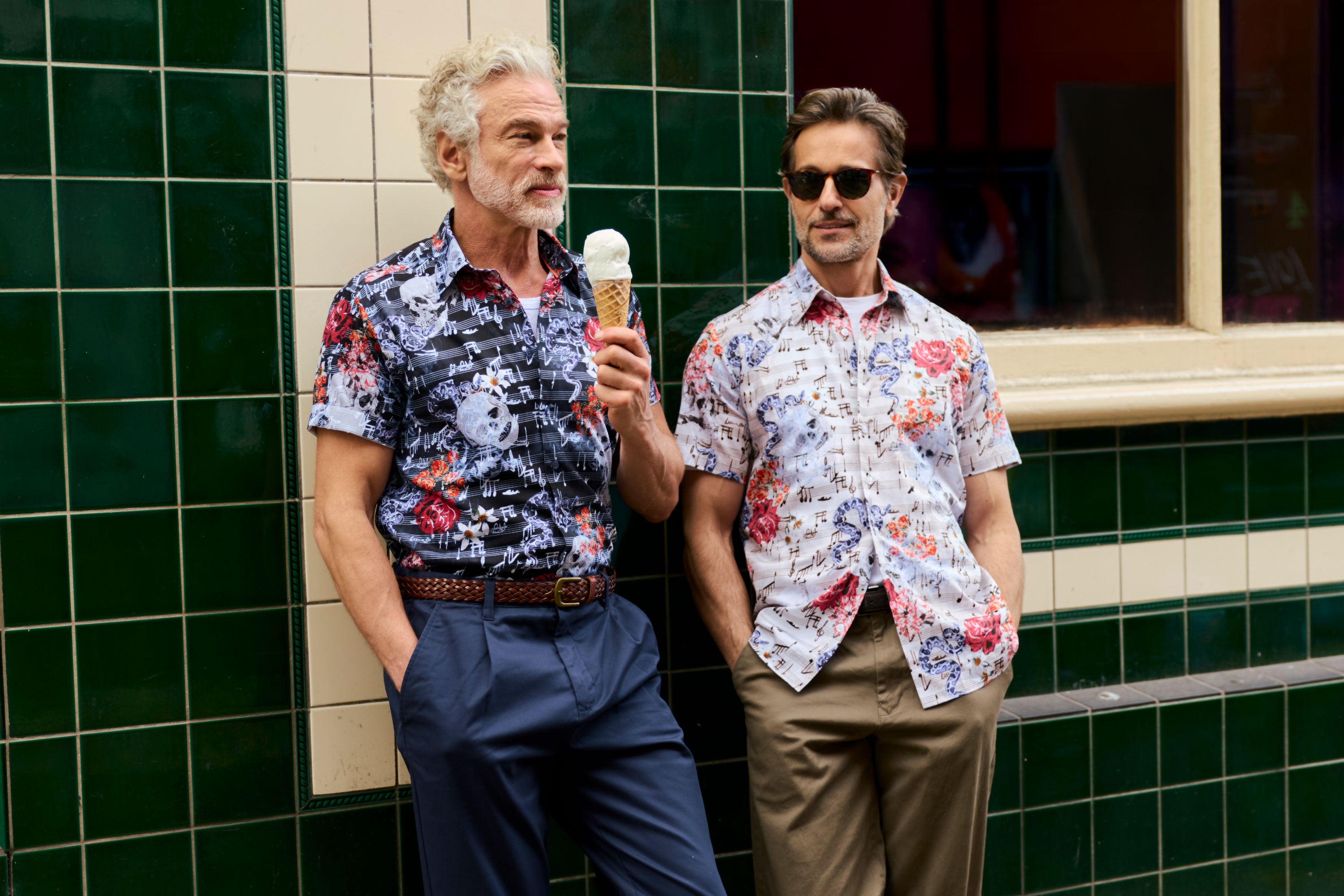
For a pub lunch, wear the printed shirt open over a plain tee with an overshirt, jeans and trainers. It is relaxed, comfortable and still unmistakably your own.
For dinner, button the shirt up and add a dark blazer or clean jacket. Swap worn denim for tailored trousers and keep footwear polished. You do not need a tie to look put together when the shirt already has character.
For creative offices and smart-casual workdays, a printed shirt under a fine knit or unstructured jacket is a strong choice. Keep the print considered rather than chaotic, and make sure the rest of the outfit is quietly tailored. It shows personality without looking like you have ignored the brief.
The right layer should make you want to wear your bold shirts more often, not save them for a single type of plan. Start with one strong print, add one purposeful layer and let the details speak for themselves.