Shirting Colour Trends Worth Wearing Now
A great shirt does more than complete an outfit. It sets the tone before you say a word. The strongest shirting colour trends are moving away from safe, forgettable shades and towards colours with real character: saturated blues, grounded earth tones, softened pastels and prints that use colour as part of the design rather than an afterthought.
For men who want their wardrobe to feel considered rather than copied, that is good news. This is not about chasing every shade that appears on a runway. It is about choosing colours that make a shirt feel distinctive, wearable and unmistakably yours.
Shirting colour trends with real staying power
The most wearable colours right now have depth. They work across smart-casual plans, dinners, weekends away and the days when a plain white shirt feels a little too predictable. Think less novelty, more presence.
Deep ocean blue remains a standout. It has the polish of navy without disappearing into the background, and it works particularly well on clean Oxford cloth, textured fabrics and geometric prints. Worn with dark denim, stone chinos or tailored trousers, it gives an outfit confidence without trying too hard.
Green is equally strong, especially in richer tones. Forest, moss, olive and bottle green all bring a calmer kind of impact. These shades feel refined with navy, black, cream and tobacco, which makes them easier to wear than their bolder reputation suggests. A dark green shirt can carry an evening look just as easily as it can sharpen up a casual overshirt-and-trouser combination.
Then there are the warmer shades: rust, burnt orange, terracotta and muted burgundy. They add warmth to a wardrobe dominated by blue, grey and black, particularly through autumn and winter, but they are not limited to cold weather. In a lightweight fabric or a print with a pale base, they can look just as good on holiday or at a summer garden party.
The key is richness. A warm colour should look intentional, not loud for the sake of it.
The rise of softened neutrals
Neutral shirting has changed. The old default was clinical white, pale blue or a washed-out beige. Now, the better neutrals have more personality: ecru, oat, mushroom, taupe, soft stone and warm grey.
These colours are a strong choice when the cut, fabric or detail deserves attention. An ecru Oxford shirt has a relaxed, premium feel that bright white cannot always offer. A stone short-sleeve shirt paired with dark trousers looks clean and modern. Taupe can be especially useful for men who want a tonal outfit without leaning on the usual black-on-black formula.
There is a trade-off. Pale neutrals are less forgiving around spills and can look flat against certain complexions if the fabric has no texture. Give them contrast through dark denim, navy tailoring, a printed layer or a richer accessory. The point is not to fade into the background. It is to create a cleaner canvas for the rest of the look.
Blue still leads, but not in the obvious way
Blue will always earn its place in a shirt rotation, but the most interesting versions go beyond business-shirt pale blue and standard navy. Cobalt, ink, petrol, slate and faded indigo offer more range, each with a different mood.
Cobalt is bright and direct. It looks excellent under a neutral jacket or with black jeans, but it needs simple styling around it. Let the colour do the work. Ink and petrol blue are more subtle, with enough depth to feel distinctive while remaining easy to wear in professional settings.
Faded indigo is the relaxed option. It gives a shirt the familiarity of favourite denim but with a sharper silhouette. Wear it with cream trousers, charcoal tailoring or tonal blue layers. Just avoid matching it too closely to jeans unless there is a clear difference in shade and texture.
Blue is also one of the best foundations for printed shirts. It can cool down brighter accents, give structure to abstract patterns and make a statement piece feel more versatile than it first appears.
Print colour is where personality shows
A printed shirt is not simply a plain shirt with more going on. Colour placement, contrast and scale determine whether it looks considered or chaotic.
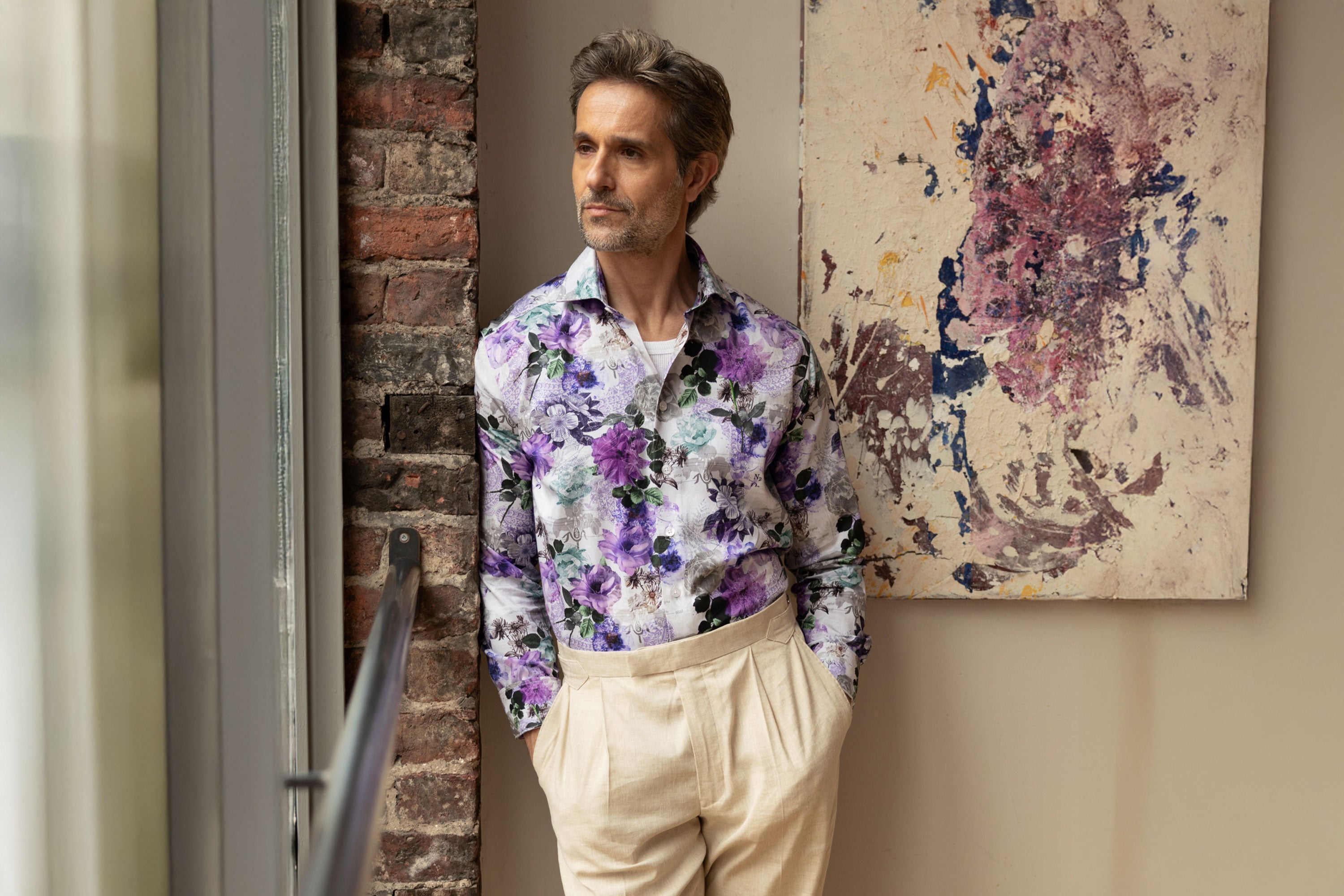
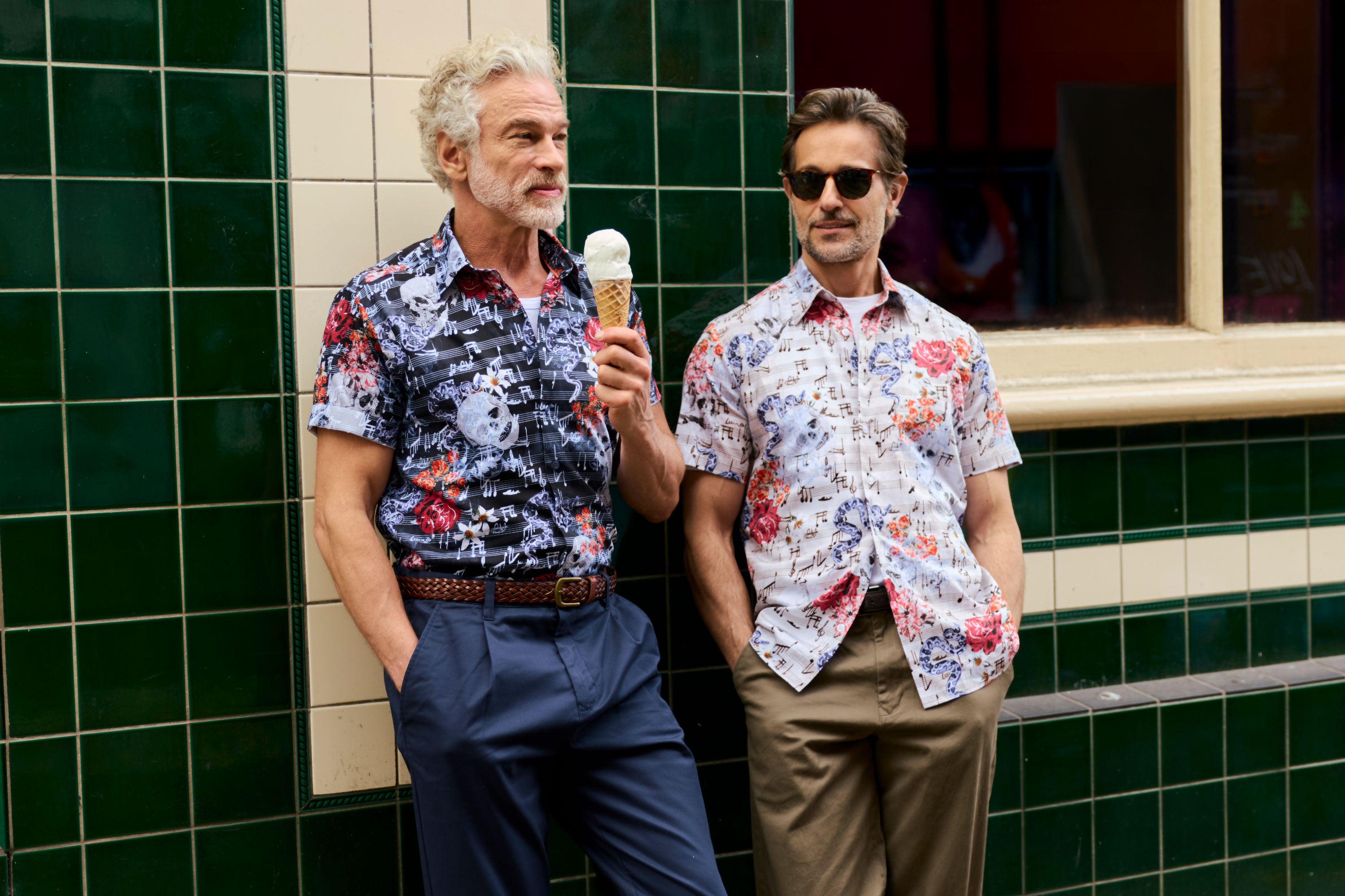
The strongest print-led direction is confident but controlled. Dark grounds with flashes of bright colour are particularly effective: navy with orange, black with teal, deep green with soft pink, or burgundy with pale blue. These combinations have energy, but the darker base keeps them grounded.
Geo prints are a smart place to start if you are building confidence with colour. Their repeated structure gives the eye somewhere to rest, so even a lively palette can feel sharp. Abstract prints can be more expressive, especially when the colours have a connection - perhaps several shades of blue with a warm rust accent, rather than every colour competing at once.
Scale matters too. Smaller patterns generally feel easier in work-adjacent settings, while larger artwork and high-contrast designs make more sense for social plans, events and weekends. Neither is better. It depends on where you are wearing it and how much you want the shirt to lead the outfit.
At Blake Mill, one-of-a-kind print designs are built for exactly this balance: bold enough to start a conversation, considered enough to wear beyond one occasion.
How to wear the latest shirt colours well
The easiest rule is simple: if the shirt is doing a lot, let everything else do less. A vivid printed shirt usually needs plain trousers and restrained footwear. A neutral shirt gives you room for bolder tailoring, textured knitwear or a more adventurous jacket.
Colour matching does not need to mean exact matching. In fact, it is usually better when it does not. Pick out one quieter shade from your shirt and echo it elsewhere. A green-and-cream print can work with olive trousers or off-white denim. A blue shirt with rust details can sit neatly with brown suede. These links make an outfit feel pulled together without looking over-planned.
For smarter settings, use colour through depth rather than brightness. An ink blue, bottle green or burgundy shirt under a navy blazer has presence, yet still reads polished. If your workplace is conservative, save high-contrast prints for after hours and use richer plain colours to keep your look individual.
For summer, do not automatically reach for pale blue. A short-sleeve shirt in olive, terracotta, deep turquoise or a graphic print has more impact with tailored shorts, linen trousers or clean white trainers. Just watch the fabric weight. Dark colours in a heavy cloth can feel unnecessarily warm when the temperature rises.
Build a colour rotation, not a uniform
A wardrobe becomes more useful when each shirt has a clear role. Keep a couple of reliable foundations - white, pale blue, navy or ecru - then introduce colours that change the mood. One deep green, one warm earth tone and one statement print will take you much further than six near-identical blue shirts.
Consider the colours you already wear most. If your trousers are usually navy and denim, green, rust, cream and patterned blue shirts will give you the most mileage. If black is your default, try cobalt, burgundy or monochrome prints for contrast. If you favour lighter tailoring, petrol blue, olive and soft pink can add interest without overwhelming the outfit.
The best shirt colour is not the one everyone else is wearing. It is the one that works with your complexion, your plans and the way you want to show up. Choose a shade with a bit of edge, wear it with conviction, and let your shirt do what a great shirt should: make an ordinary outfit feel like a considered one.